
Service:
Type:
Date:
By:
Daluci T.
Whiston
Academic Competition:
Gold Pack Awards 2025 (Finalist)
Packaging
Design
2025
Role:
-
Packaging Designer
-
Accessibility Designer
-
Research Lead
Timeline: 6-8 weeks
Tools: Adobe Illustrator
Deliverables:
-
Packaging Concept
-
Visual identity
-
Colour-blind palette
-
Dielines
-
Multi-lingual leaflet
Project Overview
The Client
Always, owned by Procter & Gamble, is a global leader in menstrual products. However, despite its wide reach, the brand’s packaging relies heavily on visual cues, making it difficult to use for visually impaired, colour-blind, or low-literacy consumers.
The Challenge
Always’ current packaging lacks:
-
Braille or tactile markers
-
Colour-blind-safe differentiation
-
Multilingual support
-
Assorted packs representing real menstrual flow
-
Accessible carton structures
This creates barriers for visually impaired users, colour-blind users, and especially for consumers in rural or low-income communities who rely on donated pads.
The Objective
Create an inclusive packaging system that users can identify, understand, and use independently — regardless of vision, literacy, or language — while staying true to the Always brand identity.
The Opportunity
A chance to develop a menstrual care packaging solution that improves dignity, autonomy, and comprehension for millions, and to demonstrate how accessibility can co-exist with brand integrity.

Impact Summary
A packaging system that enhances accessibility, clarity, and independence for users across visual, linguistic, and socioeconomic barriers.
Key Improvements:
-
High-contrast, colour-blind-safe absorbency labelling
-
Accessible tactile + Braille identification
-
Culturally inclusive multilingual guidance
-
Recyclable, resealable carton replacing soft plastic
-
Clearer hierarchy and reduced visual clutter
Research & Insights
Why Research was Conducted
To understand barriers experienced by real users and ensure the final product meaningfully addressed accessibility, clarity, and cultural inclusivity.
Research Methods:
-
Brand, product, and packaging audits
-
Competitor analysis (Lil-Lets, Kotex)
-
Colour-blind simulations
-
Accessibility research (Braille standards, tactile cues, user pain points)
-
Cultural and language research (SA top languages)
-
Material and structural packaging studies
-
Category behaviour and donation-drive usage patterns


Competitor Analysis
Lil-Lets | Kotex | |
|---|---|---|
Target Audience | A broad female audience aged 13–50, with tailored communication for both teens and older users. | Females aged 14–22, using humour, pop culture, and bold packaging to stand out. |
Gap | No assorted pad packs, English-only focus | Not designed with accessibility or tactile inclusivity in mind |
Strength | Assorted tampon packs, approachable design | Bold Gen Z appeal |
Key Insights:
-
Blind users require tactile markers and Braille for independence.
-
Colour-blind users struggle to differentiate Always absorbency colours.
-
Rural communities benefit from simple, translated instructions.
-
Donation drives value assorted packs to avoid product waste.
-
Recyclable cartons offer superior usability and sustainability.
Strategy & Concept Development
Brand Strategy
Create a packaging system that preserves Always’ empowering identity while fundamentally improving accessibility, clarity, and autonomy.
Practicality
Designed for
real-world menstrual flow.
Inclusivity
Consideration for real, diverse communities.
Clarity
Information
delivered simply and intuitively.
Dignity
Everyone deserves confidence and independence.
Creative Direction
A refined, modernised Always aesthetic using:
-
Colour-blind-safe hues
-
Clean visual hierarchy
-
Distinctive tactile flow-dot system
-
Soft, inclusive gradients
-
Braille seamlessly integrated into the design
Messaging Pillars


Process
Exploration & Early Drafts
-
Reworked Always’ colour palette into a high-contrast, colour-blind-friendly system
-
Prototyped tactile flow dots + Braille labels on pad fronts and carton
-
Tested visual hierarchy to reduce clutter but maintain brand recognisability
-
Explored gradients and typography scales to improve readability
-
Iterated dielines based on existing pantyliner carton structure


Evolution of Designs
-
Adjusted type contrast for improved legibility
-
Retested palette under Deuteranopia, Protanopia, Tritanopia
-
Refined multi-flow icon system
-
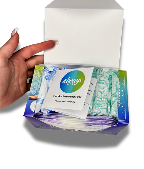
Integrated leaflet layout into interior packaging
-
Enhanced carton usability with resealable flap


Final Outcome
A fully accessible, recyclable carton box featuring:
-
Tactile flow dots for absorbency levels
-
Braille labels on the front and side panels
-
Colour-blind-safe palette and iconography
-
Resealable lid for daily usability and discrete storage
-
Assorted compartments for heavy / regular / liners
-
Clean, reduced clutter visual identity


Results & Impact
Strategic Outcomes
-
Improved accessibility for visually impaired users through Braille + tactile elements
-
Clearer differentiation for colour-blind and low-vision consumers
-
Greater inclusivity of South Africa’s multilingual population
-
Better user alignment with real menstrual flow patterns
-
Higher usability with a durable, resealable carton replacing soft plastic
-
Enhanced dignity for users relying on donated pads
Student Gold Pack Awards 2025 – Finalist
Acknowledged for innovation in accessible packaging, inclusive design, and community impact.
Reflection
This project taught me how accessible design can significantly increase independence and dignity for users who are often overlooked in mainstream packaging.
What I Learned
-
How to adapt packaging for real-world needs across vision, literacy, and language barriers
-
Designing inclusive colour systems tested for accessibility
-
Integrating Braille and tactile cues while respecting brand constraints
-
Structuring cartons for usability, sustainability, and education
How the Project Improved My Skills
-
Elevated my accessibility-led design process
-
Strengthened my understanding of user-centred packaging
-
Improved my ability to merge brand identity with inclusive design
-
Enhanced my technical packaging skills (dielines, structural layouts, finishing techniques)

