Packaging Design
Always
An accessible packaging redesign for Always menstrual products, created for the Student Gold Pack 2025 competition.
The concept focuses on improving physical accessibility, information clarity and inclusivity throughout the packaging experience.

THE WORK
Accessibility,
Built into every Detail.
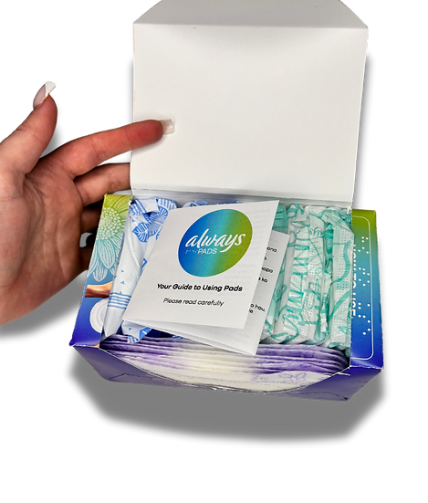
The packaging system was developed to improve clarity, handling and ease of use across every touchpoint, while maintaining a cohesive and recognisable visual identity.


RESULTS & IMPACT
A more considered experience, from pack to product.
The redesign created a clearer and more inclusive packaging system that improves navigation, handling and understanding across the user journey. Accessibility was treated as part of the design itself, resulting in a solution that feels more intuitive, supportive and purposeful.
-
Improved accessibility for visually impaired users through Braille + tactile elements
-
Clearer differentiation for colour-blind and low-vision consumers
-
Greater inclusivity of South Africa’s multilingual population
-
Better user alignment with real menstrual flow patterns
-
Higher usability with a durable, resealable carton replacing soft plastic
-
Enhanced dignity for users relying on donated pads


